Sunday, 15 June 2014
Exhibition - Set up and Changes
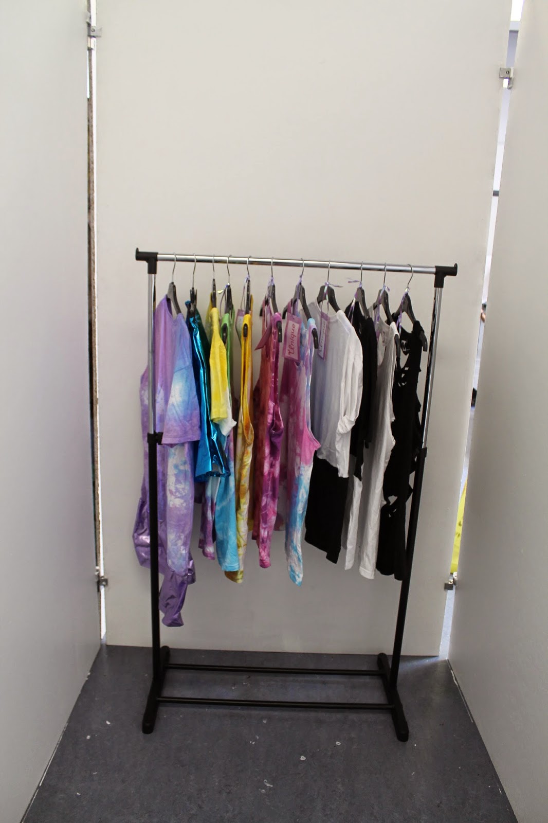
Exhibition - Set up 1
On my original exhibition set up I was going to have a shop as you can see from how the frame has been built. I had planned all this by drawing a shop layout on paper. After see the space and placing a few things inside the layout I realised that my plan wasn't going to work out how I wanted it to be.

I put up a open/closed sign on the front of the shop, as well as a list of opening time for people to come and visit.

Website and Promotions
Promoting the brand.
I'm going to use social media to promote the brand, I am going to use Facebook and Instagram to post image of my products and discounts to lure people towards looking at the products and why them.
Webpage - Selling the Brand
As part of my project I decided to build a brand and shop. I have also created a digital shop on my website @ http://rachbarber.wix.com/unique. I have set the website up using the webpage maker wix.com, I went to the create a business section on page and selected a template I liked, adjusted the layout to how I wanted my site to be.

On the home page I have a direction bar at the top that links to my shop, contact information and question about the brand and business and also the shopping cart so you can see what you have purchased.
Home Page - I have added the details to when my shop will be having a preview opening to show people the brand and what styles I have created. I have also added a link to the brands Facebook page and this blog so that people can see the creative journey I had to go on to make my brand and business.
Shop - In the shop I have three collections to chose from. I have created two style of clothing based on different looks and a small accessories section, which only includes hair scrunchies. My shop is small that is because it is only a small on growing business. I have used studio photography to capture what the products look like on real people.
Monochrome - The monochrome collection was inspired by Vogue, ASOS Magazine and ASOS fashion finder. There are also two vest tops in this collection which are part of the monochrome look but were inspired by Robert Morris and his work 'Untitled 1967-8 remade 2008' using the material felt. { See my research for a better understanding of my inspiration }

Tie Dye -

Scrunchies -
Thursday, 12 June 2014
Studio Photography
Studio photography
I have used the studio to take images for my website. I have used a manikin to display the product on first, but I wanted my product to be shown more realistically.
I then changed how I was going to display my product on my website; I have used a male and female to model the products. I have used studio equipment such as soft boxes and lightings to create a set up to best display my products.
Tie - Dye
I have used the studio and a makin to take photographs of my final product that i will be displaying in my exhibition. I have take a front view, side view and back view of the product.
Monochrome
Inspired by
Wednesday, 11 June 2014
Metallic - Hair Scrunchies
Photographing the Products
To photograph my products i didn't use the studio or lights to enhance the colouring of my products. I photograph them on top of a white piece of card. I have used the images to place on my website for product display and for people to buy.

Products
My inspiration for creating these designs for part of my collection was from Vogues fashion trends : Mine craft and Asos magazine. I really liked the bright colours that Vogues designers used and picking brigher fabrics for my products was a good choice for me.
I have managaed to create a set of bold, young and unique designs.
To photograph my products i didn't use the studio or lights to enhance the colouring of my products. I photograph them on top of a white piece of card. I have used the images to place on my website for product display and for people to buy.
Products
My inspiration for creating these designs for part of my collection was from Vogues fashion trends : Mine craft and Asos magazine. I really liked the bright colours that Vogues designers used and picking brigher fabrics for my products was a good choice for me.
I have managaed to create a set of bold, young and unique designs.


This material was really easy to sew I didn’t have any problems with running the fabric along the machine. The material choice was inspired by Vogues fashion trends: Mine Craft. I really like the colour of the material when picking it out. I think making it into a hair scrunchie was a good choice; I didn’t want to create a product that was too over powering.


When sewing this material,
I found it really difficult. The material wouldn't sew and the fabric just kept
pulling leaving holes and rips in the shiny fabric. I really liked the material;
I thought it was unique and young. The colours on this material are vibrant and
fit the theme I was going for with creating my brand.


I didn’t have any problems with sewing this fabric also. I really like the materials high shin and sparkle to how it has come out.
Metalics - Making process of Hair Scrunchies
I have captured my development process of how I have created my hair accessories for my line. I have used the same materials that I will be using to create my garment with, these colours of materials all link into my trend research from vogue. I wanted to stick to what I had researched as metals are on trend at the moment I wanted to add this to my line, in more chance of customers buying the products.

I have used a Ruler, pen and Pins to mark and cut a 50 cm by 6cm in all of my fabrics for the scrunches’. I used the pins to pin and mark the top of my material so I could sew at a 1/2cm seam allowance. Before sewing the material I had to make sure that my bobble / hair tie was suitable before wrapping the material to sew.

After sewing at the ½ cm sew allowance and completely going round the whole strip of material till it was secured to the bobble / hair tie. I then used the scissors to cut access thread and also to trim down the access material. After doing this I then need to turn the material inside out to the ‘right’ side of the material.
I then repeated the same technique on my other materials to create a number of different material scrunches’ for part of my line. Here are some of my finished products.

Metallics - Digital Designs
Digital Designs
I'm going to be using the software Photoshop to create my digital design for my scrunchies. I have taken a temple of a scrunchie that has already been made from Google images. I have opened it up into Photoshop. I have then taken a photograph of the material I have picked to create my design with to make sure they will look alright before proceeding to make the outcomes. After doing this I opened the images into Photoshop. I used the magnetic lasso tool to draw around the scrunchie and then added a new layer. I then went onto my material image and used the clone tool to pick up a sample of the colouring. I then went back to my scrunchie image and painted the clone on over the image to add my material to see what the outcome would look like. Once I was happy with one of the outcomes I then duplicated the layer to product a row of 9 hair scrunchie designs. I then used the HUE / Saturation tool to adjust and change the colours to create different outcome designs.
Design Outcome's
Design Outcome's

I am really happy with how my digital design have come out. The top left image I the sample of my metallic material I have bought. All of the other colour are manipulated images. The bottom middle image and the Top middle image look like material that has been used on Vogues fashion trends - Minecraft. I am glad I have chosen the metallic trend fro my inspiration cause I have produced a unique set of designs that I will be using for my brand.
Metalics - Plan and History.
Plan - I was inspired by images I had seen in vogue and ASOS magazine of designers using metallic coloured fabrics. Also that metallic is on trend this year. My plan is create some hair accessories for my clothing range. Also coming back on trend this year is hair scrunchies, I'm going to buy different bold metallic synthetic fabrics and make hair scrunchies from this material.

HistoryA scrunchie (or scrunchy) is a fabric-covered elastic hair tie, commonly used to fasten long hair.They were particularly popular from the late 1980s into around the mid 1990s.
Metallic Research - Vogue vs ASOS

Metallic print is big trend this year as well as hologram prints. The colours can be very bold or simple but still make a statement. Vogue have featured very bright and bold colours from their designers chosen. Mainly gold, silvers and a wonderful shinny green.

I have scanned in a image I really like that I can compared to Vogues metallic trend from ASOS magazine. The model I holding a simple statement silver clutch. The colour is not over powering the models outfit, but the colour is still bold enough to make that statement that she wants.
Metallic prints haven't been a massive trend in the high street yet, but they have been a hit on the cat walk. I think that this is because a all metallic print garment is a bold and powerful outfit. The way that cat walk models look and their posture they can pull off the look. Where as most people wouldn't be brave enough to wear such a bold colour/ print. So I think the high street with just create smaller garments in the print such as skirts or tops and accessories.
Monochrome - Images of final Garments
Monochrome Final Product - Studio PhotographyThe product images are the final outcome of my digital design and my monochrome inspiration from VOGUE, ASOS Magazine and fashion finder. These products are my Unisex T-shirts. They are men's sizes and have been custom made. They will also fit female buyers as well, who like the slightly oversized Boyfriend T-shirt look.
I have used the studio and studio equipment such as soft boxes and over head lights to take my product image on a model.

I have taken a front view of the product to show the customers what the product looks like on.

I have also taken a side view of the T-shirt. These image have been edited in Photoshop, I have adjusted them slight by using auto tone, contrast and colour.
I have repeated the same style in take my other design on the monochrome look using the studio to take a front and side view of the product. I have edited the images in the same way also.
I have repeated the same style in take my other design on the monochrome look using the studio to take a front and side view of the product. I have edited the images in the same way also.


I am really happy with my product outcomes. I will be using the images I have taken to put on my website for the brand, I will also post them on the brands social network page Facebook. This is a way of promoting the products which I what I wanted to do.
Robert Morris - Inspired Designs
Once again I have used the studio to shoot my product on the model's. I used the same set up and editing techniques.

I think the cuts to the front make it different and unique to the white vest.

The black vest is my favourite out of the two final designs. The back has been cut straight and it is exactly how I wanted it to be from my digital design. It is also the same colour as the felt which Robert Morris used to create his piece of art untitled.

I haven't added any detail to the front of this vest I just wanted to leave it blank because I wanted the back to be more dramatic.

The cutting of the back is abit messy, it is not as straight cut I would like it be but I can always do this on other products.
Monochrome - Digital Design and Plan
Monochrome - Digital Designs
I have used the software Photoshop to create digital design of my monochrome t- shirt's inspired by Vogue and ASOS.
I have used the software Photoshop to create digital design of my monochrome t- shirt's inspired by Vogue and ASOS.

I have created a front and back, digital illustration of what I want my monochrome inspired t- shirt to look like. My plan is to buy two t-shirts already made and customise the garment. I'm going to buy one white and one black medium t-shirts. I'm going to use fabric scissors to cut half of the bottom of the t-shirt off. I'm then going to use a sewing machine to sew a 1 cm seam along the two t-shirt to combine the two colours and make one monochrome t-shirt. This is my first design I wanted the black to be at the bottom of the white t-shirt.

This is my second monochrome inspired design. I'm going to be sewing the bottom of the white t-shirt to the top of the black t-shirt to create another monochrome custom look.
Robert Morris Inspired Designs
I'm going to be using my inspiration by Robert Morris work untitled and use scissors to cut lines in the back of two vest tops to see what that look like. I'm going to create this inspired design on a black and white top, so that they fit with my monochrome theme.
Robert Morris Inspired Designs
I'm going to be using my inspiration by Robert Morris work untitled and use scissors to cut lines in the back of two vest tops to see what that look like. I'm going to create this inspired design on a black and white top, so that they fit with my monochrome theme.

I have used Photoshop to create my digital designs. I got a front and back vest template of Google images and manipulated the blank template to create my own digital illustrations.

Monochrome - Image Researchand Inspirational Plan
I wanted to look more into both men and women's wear, I had already done this by looking at Vogue and ASOS magazine on women's wear. I came across this page on ASOS fashion finder of men wearing the monochrome look. When I looked the home page it wasn't mostly monochrome but the individual colours of all black or a mix of all black with a slight touch of white.

Inspiration


I really like what this male is wearing, I think his outfit looks classy and stylish. I am quite unsure how this outfit comes to fit under the word monochrome, because it is meant to be a mix of both a white and black garment. However I do like the style of his oversized T-shirt which is looking to be a big trend in men wear this year.
I then went on to look at what other males were wearing on the fashion finder site.I have noticed that on ASOS fashion finder most of the males are wearing oversized T-shirt. when I looked at Vogue and ASOS on women's wear they had also created over sized T-shirt, this must be another trend on the market. This male is wearing a over sized white tee, making his look some style of monochrome, but he is not wearing the trend to the key point.
Inspirational Plan - Looking at these images has inspired me to create a monochrome oversized T-shirt look that can be worn by both sexes. My plan now is to create some digital design that have been inspired by these males, on ASOS.
Gallery Visit
I have also been inspired by my recent visit the London Tate gallery. I really found ' Untitled' by Robert Morris inspiring, I like how he has recreated his own work from 1967-8. He has used the material felt and cut in a series of straight lines.


Gallery Visit
I have also been inspired by my recent visit the London Tate gallery. I really found ' Untitled' by Robert Morris inspiring, I like how he has recreated his own work from 1967-8. He has used the material felt and cut in a series of straight lines.
How the material has been cut and how it falls has inspired me to cut into my own garment I'm going to use scissors and cut into the black of my monochrome look garment's.
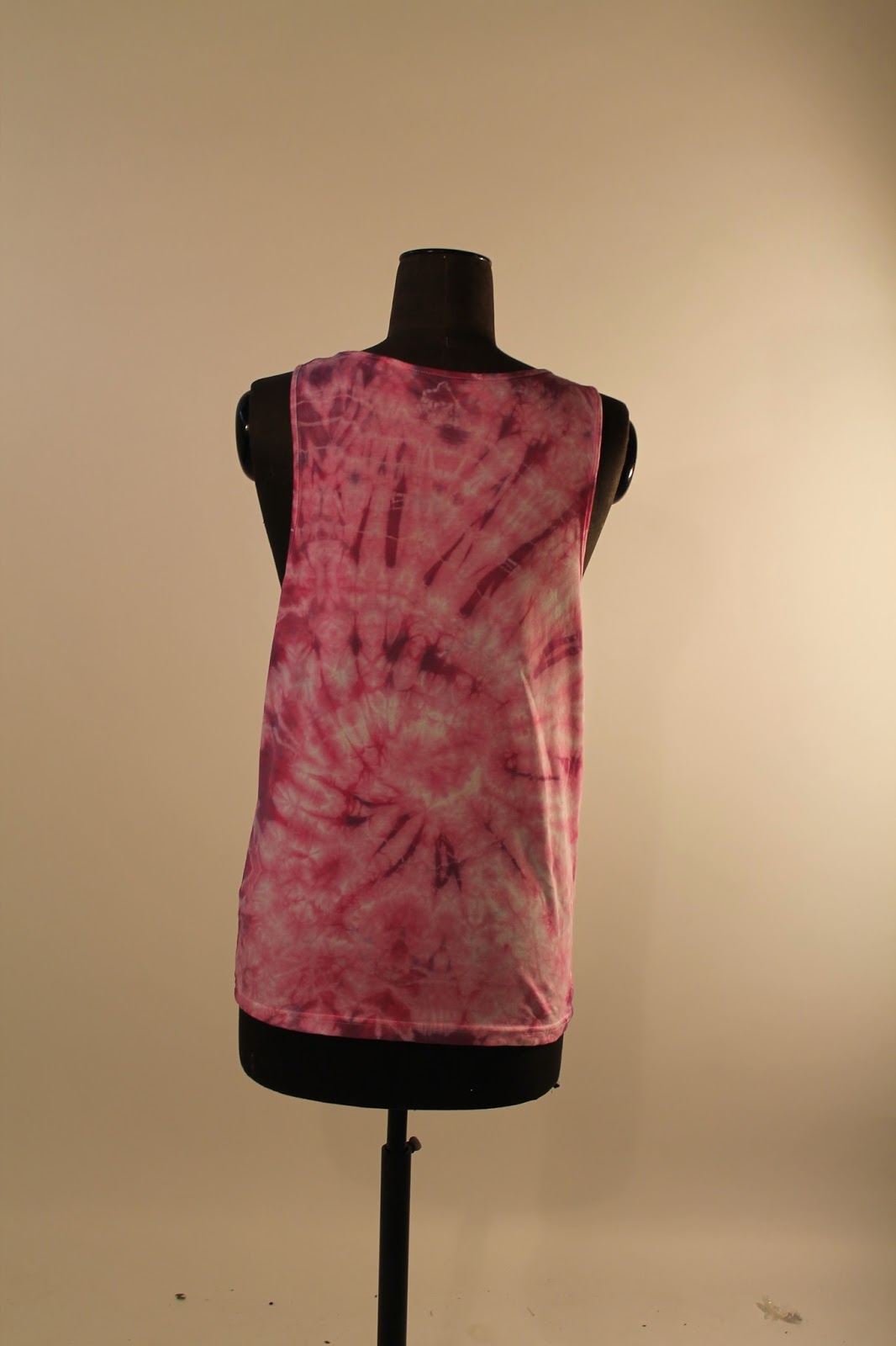
Tie - Dye - Product Outcomes
Studio Photography - Product Outcome / Display
I have used the studio to photograph my tie - dye products. I used soft boxes and lights. I didn't use a flash for the photographs. These images are to show the final product, the images will be displayed on my website and social media sites ( Facebook and Instagram). I have taken a front and side view of the model wearing the garment to show the customers what the product looks like on.Technique used
Technique - The Accordion : Inspired and used on Urban Outfitters Blog Post


With this product I left the vest to soak in the dye to get a stronger colour, I like that there are different tones where the colour has gone darker. This would be a great colour for both boys and girls and the technique used a create a strong product.
Technique - Placing bands and scrunching the material


This product I really like how there is three different colours. The top and bottom of the vest are a more blocked colour than the middle with the exposition style of pink bursting out of the middle again.
Technique - The Spiral : Inspired and used on Urban Outfitters Blog Post


I would say that this product is aimed mainly towards the women with the brightness of the pink. With this vest I left the product to soak up the dye for a longer period of time to create a more bolder and brighter colour. The different tones of pink make this outcome a lot different to other outcomes, there is more colour and less white.
Technique - Placing bands and scrunching the material


I'm really happy with my choice of colours and how using the techniques has create such an artistic product. I think it looks like the vest has been in a colour blast exposition, The way there is parts white and burst of pink, blue and purple.
Technique - Folding the t-shirt and tying elastic bands around : used 6 bands to create this effect.


I used all of the dye to create a multi-coloured effect, I dipped the t-shirt in each of the colours, leaving the top near the neck in the yellow a little longer than the other colours just to get a more brighter and stronger colour.
Tie - Dye : Making Garment Process
Tie Dye ProcessEquipment list :- Dye(s)
- Plastic Bowl(s)
- Salt: 5tbps
- Mixing Spoon- Jug
- Water - Rubber Gloves
- Plastic Bowl(s)
- Salt: 5tbps
- Mixing Spoon- Jug
- Water - Rubber Gloves
To tie - Dye my T-shirt I have bought 5 different colours of Dylon fabric dye. Purple, Yellow, Blue, Green and Pink.

I used a bowl for each different dye, I filled the bowl up with 1ltr of warm tap water. I then added 5tbps of salt to the water.

After adding the salt to the warm water, I used the spoon to mix to make sure that the salt had dissolved.

I then used the jug and added 250ml of warm water again before adding the sash of fabric dye. I then used the spoon again to mix to make sure all the fabric power has mixed with the water.

I mixed the pink dye first you can see that the colour is bright.

Finally I added the dye from the jug into the bowl where I would be able to dye my t-shirts.
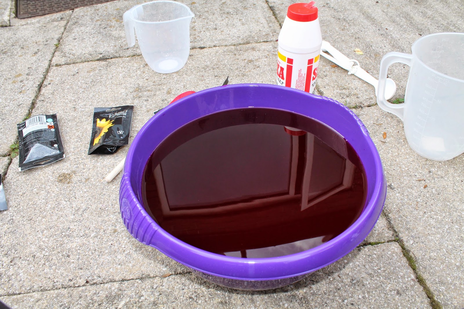
I repeated the same process with my other dyes to create the different colours.
T-shirt: Techniques
To help me with tie - dying my t-shirt I used the blog post from urban outfitter :
To help me with tie - dying my t-shirt I used the blog post from urban outfitter :
The technique I used for this t-shirt is called the spiral. I pinched the middle of the shirt and twisted to make a big swirl I then secured the t-shirt with elastic bands.

I placed my t-shirt that I was getting ready to tie- dye in the bowls just for show before dying them to show how I was going to do this.

The technique I used for this t-shirt is called the accordion. I folded the t-shirt in half and then made horizontal line by folding the fabric again. To secure the t-shirt and make sure I get the effect I want I used elastic bands.

This technique is not inspired from the Urban Outfitters blog post, I just used elastic bands to fasten some of the t-shirt to create circled and make sure that them patches stayed white.

How I dye the t-shirts - For some of the t-shirt I left them in the dye longer to get a more vibrant, brighter colour but with other I just dipped them in to get a more funky and cool tie - dye effect.


You can see that the colouring is really bright and vibrant this is because I left the t-shirt in the dye for 20 minuets. To get a stronger and richer colour.

I did the tie - dying in my garden because the process is really messy, I placed my t-shirt on black bin bags to dry off after being dipped in the dyes.


Subscribe to:
Posts (Atom)